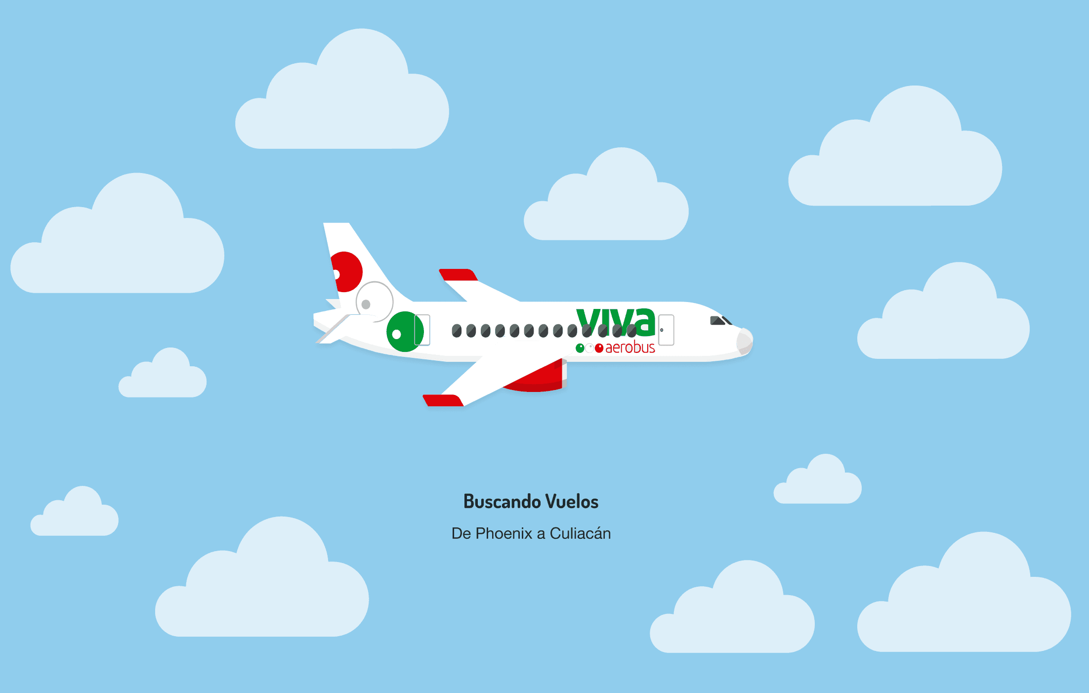
VIVA AEROBUS - OCT 20
A renewed digital experience to increase the sales of flights
Designed a prototype that solves critical points in the Viva Aerobús purchase process
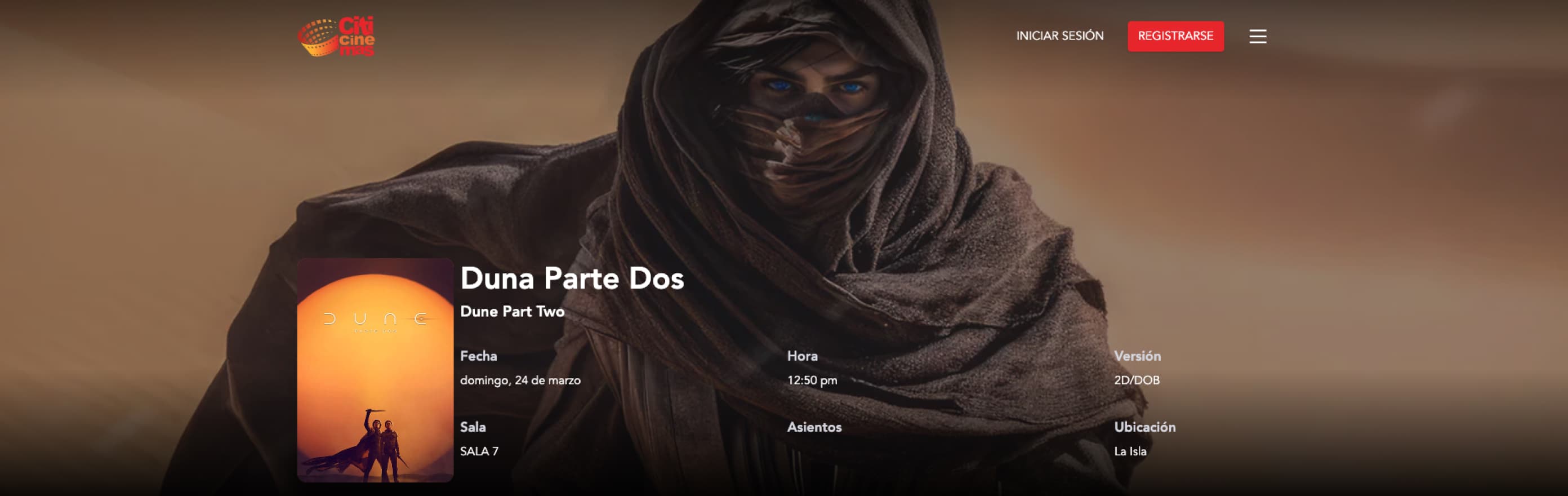

| Client: | Citicinemas |
| Industry: | Entertainment / Movie Theaters |
| Role: | Product Designer End-to-End (Analysis, Design, and Development Collaboration) |
| Duration: | 8 weeks |
| Context: | Agency Project |
Citicinemas had a website developed several years earlier, with clear performance, experience, and user acquisition issues. Most purchases were made as guests, registration was low, and the purchase flow had multiple steps that created friction.
Beyond the visual, the site was not designed to capture long-term user value: without active accounts, the business was losing opportunities for recurrence, loyalty, and direct communication.
As an agency project, the challenge was to act quickly, with limited information and no long-term roadmap, maximizing short-term impact without breaking the existing operation.
The main problem was not just “an old site,” but an inefficient purchase flow that combined:
Each additional friction increased the likelihood of abandonment and limited the growth of the digital channel.
During the design of the purchase flow, we evaluated two clear alternatives:
Option A — Follow the Standard Market Pattern
Movie → number of people (adults, children, seniors) → seat selection → payment. It was a known, safe, low-risk pattern.
Option B — Break the Traditional Pattern
Movie → direct seat selection, where each selected seat automatically represented one person, building the count in real time.
This second option reduced steps and simplified the experience, but implied a clear risk: breaking user expectations, especially for people less familiar with digital flows.
We decided to move forward with the unconventional option, prioritizing friction reduction and clarity over familiarity.
In the following video, you will see the resulting interaction of combining seat selection and ticket type.
We tested both alternatives with real users before committing to the final solution, including older adults. The goal was not to optimize details, but to answer a critical question: Is this interaction understandable without explanation?
The answer was positive: users quickly understood the relationship between seats and ticket quantity, could correct errors easily, and completed the flow faster.
This gave us the confidence we needed to take the risk and move forward.
After the redesign, the digital channel performance showed clear improvements in key metrics:
In a context where demand varies by film type and season, the redesign helped better capture purchase intent by simplifying decisions, reducing steps, and improving site speed, converting more sessions into completed purchases.
This project reinforced my approach as a Product Designer: understanding the real problem, evaluating alternatives, taking informed risks, and making decisions that balance business, technology, and experience, even in contexts with limited time and resources.
This is the result of many minds working together. Thanks to everyone involved in this creative process, especially Efrain Rochin and Ezequiel Rangel.