MAXILANA - NOV 21
A Satisfying Local Shopping Experience for a Pawn Shop
Created a Consistent Design System, Improved Navigation, Offered a Second Hand Buying Experience.

| Client: | Viva Aerobús |
| Sector: | Airline |
| My role: | User Experience Design and Prototyping |
| Project time: | 3 weeks |
Viva Aerobús is one of Mexico's leading airlines. In October 2020, it had an app with a very poor user experience and many opportunities for improvement. At the agency, we set out to create a high-fidelity prototype to find an opportunity to work with them.
Analyzing the app and critical points, we found several problems and room for improvement, such as:
Our intention was to continue with the current website flow, with only minor changes that would improve user orientation by grouping all flight extras in one section.
Once this problem was solved, we designed two components that would be present throughout almost the entire flow and would serve as a common thread guiding the user on the path to their goal.


Once we defined the structure of the main flow, we could propose the details of the screens. We chose 3 parts of the process that we considered critical for the overall user experience:
We proposed a calendar design that helps the user reduce uncertainty about knowing the cost of a flight when selecting departure and return dates. At a glance we provided dates with available flights and their cheapest prices. On the same screen we provided clarity in date selection using colors and contrasts for outbound and return flights, which would be present from this step onward.

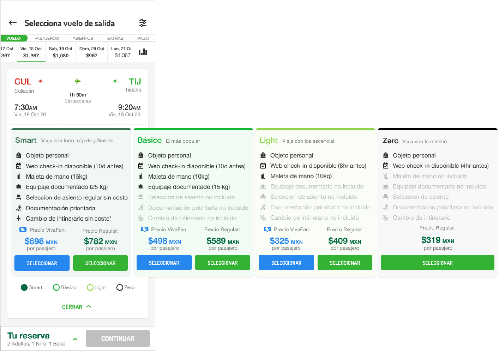
One of the most important screens is the flight schedule and package selection; the main challenge was to allow the user to clearly explore a large amount of information related to flight results, with their dates and details, on a single screen.
To achieve this, we defined the layout of elements that the design would have to display all information clearly and conveniently for the user.
We show at a glance the most relevant information for each flight, adding actions to see more details. We designed the package and price information to navigate horizontally, providing context on which flight is being explored and the features of each package.
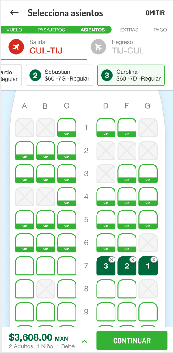
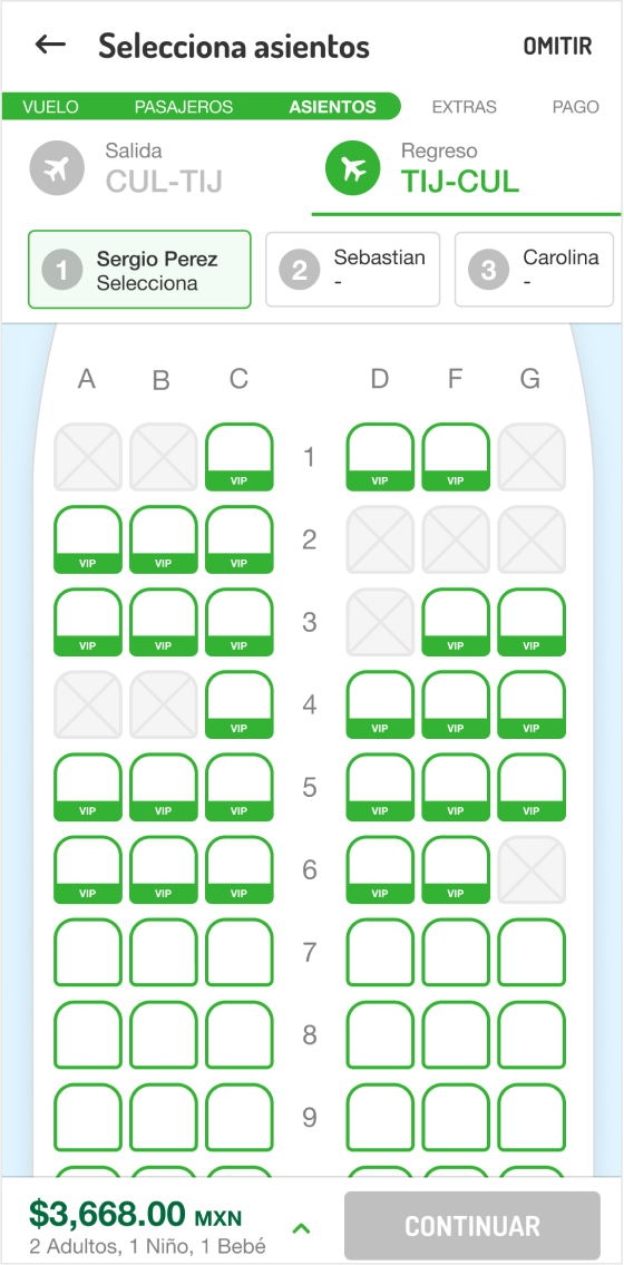
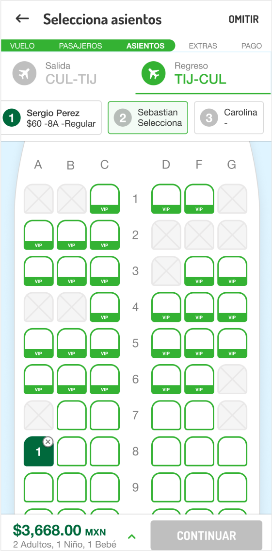
On the seat selection screen, our goal was to design the components in such a way that the user was aware of which seat they were selecting, for which passenger, and on which flight. This design allowed the user to modify any previous selection if desired.
This project was very challenging thanks to the number of interactions it has. Creating a project of this complexity in such a short time showed me how capable I am of designing and proposing.
In the end, a functional prototype was created by the developers and presented to the client. They were impressed. We could not close the deal with them, but we opened the doors to work with them in the future.