
CITICINEMAS - MAY 22
Increasing Ticket Sales by Improving the User Experience
Reduce Friction, Increase Registrations, and Improve Performance in the Purchase Flow.
| Organization: | Coppel |
| Platform: | Android |
| Focus: | Design System / Mobile Foundations |
| My role: | Principal / Foundations Lead |
| Scope: | Library rebuild, handoff, and alignment with engineering |
Coppel was running two initiatives at once: digital transformation and rebrand. This brought new foundations (color, typography, elevation, borders, text) and created the right moment to rebuild the Android component library and prepare the ground for migrating full journeys on a consistent base. This case study specifically documents the Android front within Coltrane's evolution.
The previous Android library had high variation and little governance. There were too many colors and inconsistent patterns inside the library repo, which affected visual consistency, accessibility, and delivery speed.
The previous Android base reflected accumulated debt:
As Principal / Foundations lead, I drove the project and made sure it moved forward with quality and speed:

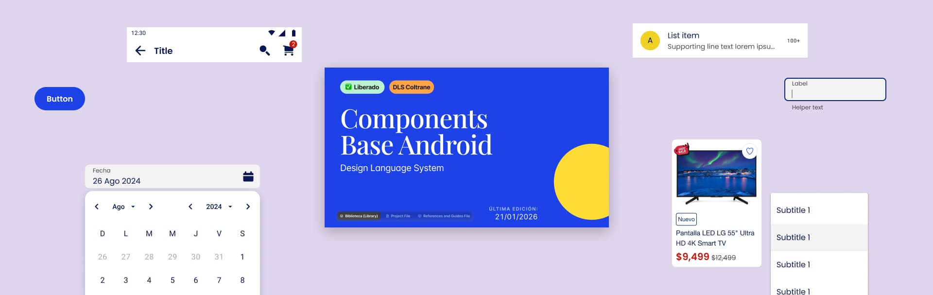
We used Material Design as the base to keep native patterns and scalability. From there, we defined a customization framework that reflected Coppel's identity without breaking behavior, accessibility, or technical viability.
We turned color into a design decision, not "loose variants". In Android, the library went from ~186 colors to 43 total colors, with defined semantics (colors with clear intent and use in the interface).
The challenge was to create a full library in a short time without sacrificing consistency, states/variants, accessibility, and alignment with engineering.
Besides designing and documenting components, I took part in testing in a real environment. I installed and used Android Studio to review implementation and catch behavior details that don't show up in Figma. The system was implemented on a Material-first base in a hybrid stack (XML Views + Jetpack Compose, with a clear path toward Compose). We also worked with an XML file to define and consume tokens (colors, typography, elevations), ensuring consistency between design and code.
Accessibility was integrated into the Android system standard, with practical rules that helped the team design consistently for native patterns and screen reader usage.
39
Components documented
43
Colors in Android library with defined semantics (before ~186)
232k+
Component instances used in Figma (design adoption)
30,900
Estimated hours saved (estimate)
$6.7M MXN
Estimated efficiency impact (estimate)
This project was a key enabler for Coppel's new app: the library became the UI base to build and scale the experience during the digital transformation. The metrics in this case correspond to the Android scope; the Coltrane case also reports global foundations metrics (Legacy and Bubble).
On a personal level, the main learning was going deeper on Android accessibility and understanding real technical limits. Between reviews with development, handoffs, and QA on build, I learned to translate design decisions into implementation without losing consistency or quality.
Working in Android Studio raised the bar for validation: it made it possible to review accessibility and interaction details with precision, and to strengthen the bridge between design, system, and final product.