VIVA AEROBUS - OCT 20
A Renewed Digital Experience to Increase the Sales of Flights
Designed a Prototype That Solves Critical Points in the Viva Aerobús Purchase Process

| Client: | Maxilana |
| Sector: | Pawn Shop |
| My role: | User Experience Design and Development |
| Project time: | 6 weeks |
Maxilana is a pawn shop, personal loans, and product auctions company based in Mexico. It has 74 branches in the cities of Culiacán, Mazatlán, Hermosillo, Mexicali, Tijuana, and Guadalajara.
During the pandemic, our agency was facing a difficult period with a declining client base. To address this, I took the initiative to create a prototype to attract potential clients. My goal was to show the value of the project and sell the idea to Maxilana, a business that had been hit hard by the pandemic.
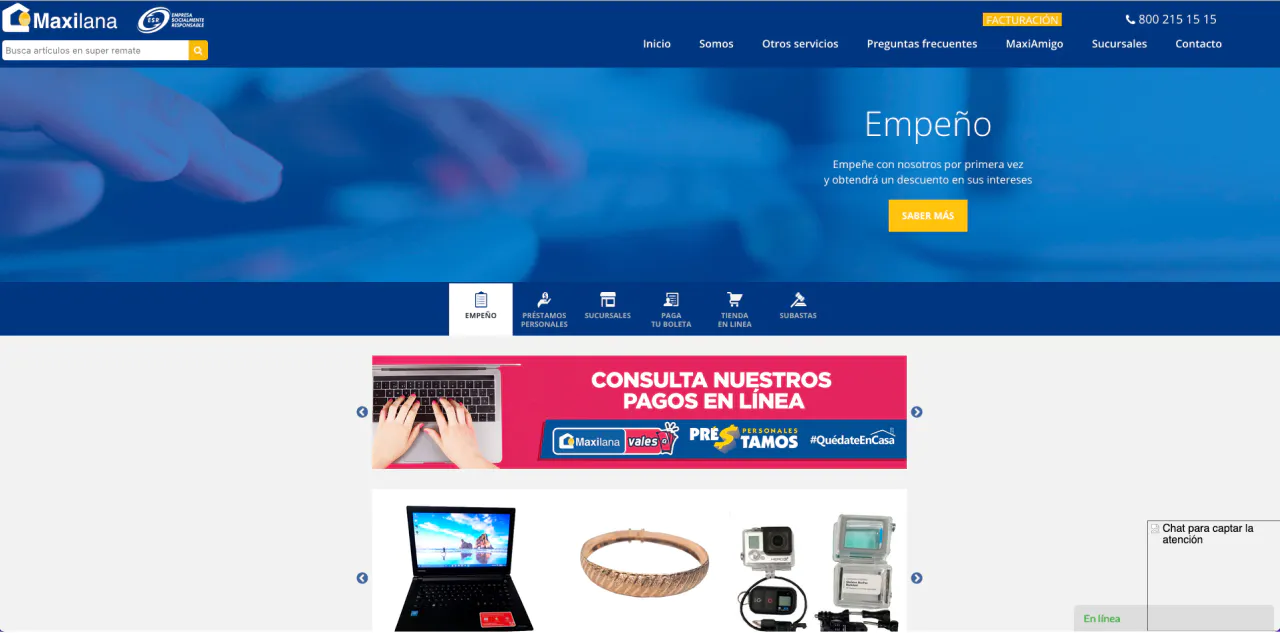
Store visits and Maxilana sales had dropped significantly, and their website was difficult to use, which further hindered online sales. My role was to identify the potential that Maxilana already had with their infrastructure and find ways to fully leverage it. Inspired by platforms like Offer Up and Facebook Marketplace, my goal was to make Maxilana's online presence a go-to destination for second-hand shopping.
Conducting a heuristic evaluation to identify usability issues.
Given the time constraints, I conducted a heuristic evaluation of Maxilana's existing site based on usability principles. This allowed me to quickly identify the most urgent issues impacting the user experience.
The main usability issues identified during the evaluation were:
These findings formed the basis of our design strategy, allowing us to focus on solving key pain points that prevented a smooth shopping experience.
The biggest challenge was time. The project had to be executed quickly, and we did not have complete data on their infrastructure. Another difficulty was understanding how Maxilana's inventory system worked, particularly the division between in-store and online sales. Ensuring a smooth experience for users navigating between these two channels was key to the redesign.
Building a Design System
To bring consistency to the platform, I designed a custom design system for Maxilana. This included foundations such as colors, typography, borders, and rounded corners. Then I designed components with different states and properties, ensuring they aligned with the system.
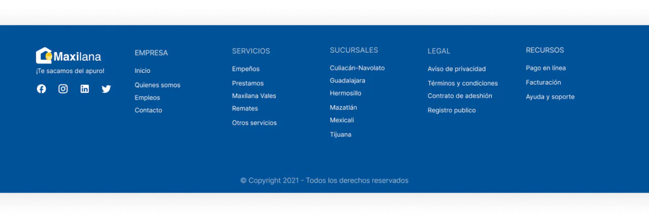
Simplifying Navigation
To improve navigation, I conducted a card sorting exercise with Maxilana staff and my colleagues at the agency. This helped us restructure the site's information architecture and make navigation more intuitive, allowing users to find what they were looking for with ease.
Resulting in two of the main interface components, the menu and the footer.

User-Centered Design
Although I did not have the opportunity to conduct formal user testing, I gathered informal feedback from colleagues and acquaintances to refine the design. One of the key decisions was to create a filter that allowed users to see combined inventories by default but also gave them the option to filter by location for in-store products.
We significantly improved the site's performance by migrating to Next.js, resulting in faster load times and a more responsive experience for users. The improvements were clearly reflected in the before and after optimization metrics.
Initially, the First Contentful Paint was 3.3 seconds, and the Time to Interactive was 13.4 seconds, both contributing to a slow user experience. However, after the transition to Next.js and optimization efforts, these metrics improved significantly. The First Contentful Paint dropped to 2.0 seconds, and the Time to Interactive was reduced to 3.0 seconds, greatly improving performance and user engagement.

As shown in the performance audit before the redesign, the First Contentful Paint took 3.3 seconds and the Time to Interactive was over 13 seconds. This indicated significant delays in the user experience, particularly in how quickly content was rendered and how soon users could interact with the site.

After optimizing the site, the First Contentful Paint improved to 2.0 seconds and the Time to Interactive dropped to 3.0 seconds. These changes made the site faster and more responsive, directly contributing to greater user trust and a notable increase in pawn payments and loan applications.
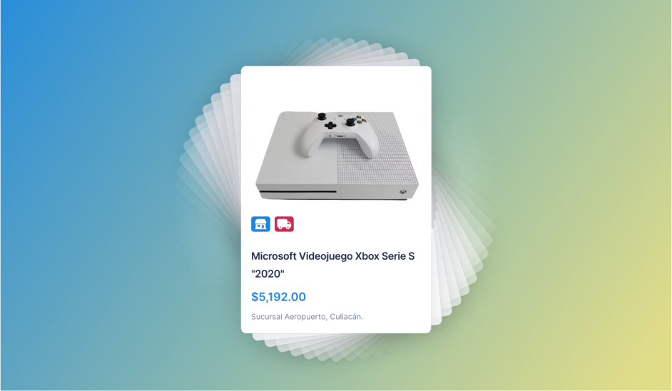
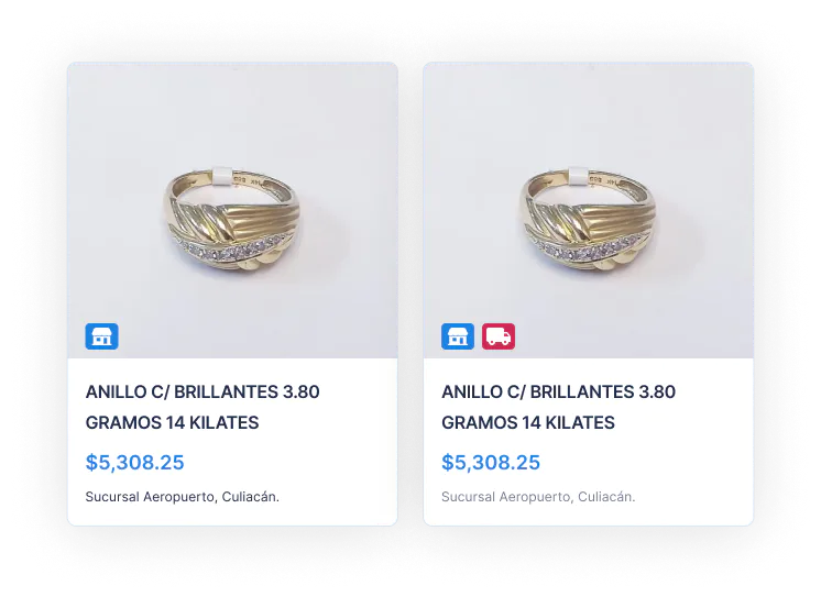
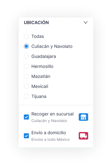
Creating an Experience Where Online and In-Store Inventories Are Combined
One of the main challenges of this project is being able to offer a unique experience for selling used auction items. Only some of the products in their inventory are eligible for direct online sale; that is why it is important to be able to show the user locally available items while adding products that can be sold online.
To educate the user that there are two types of inventories, two indicators were designed that allow us to know whether the product is for 'home delivery' or 'branch pickup'.
That is why it was essential to design how the user would select the location. In addition to always having access to the menu, a filter was created for the product list. By default, inventories are always shown combined. Selecting the city filter gives you the opportunity to separate inventories.
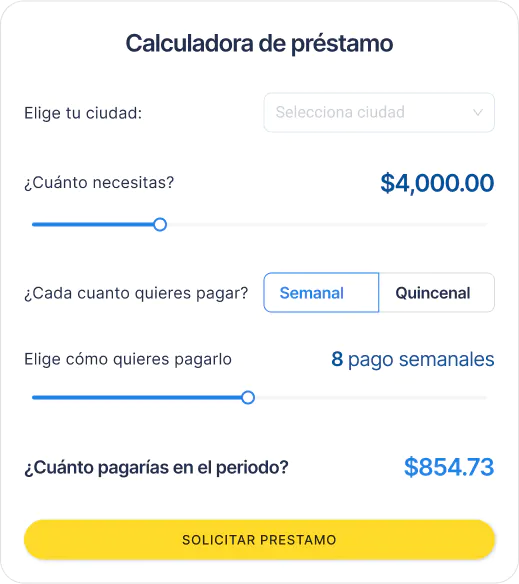
Designing a 'Lead Magnet'
To attract more prospects for the personal loan service, we created a calculator that helps customers know how much they have to pay and how often. In addition, when applying for the loan, we gave the user the option for Maxilana to contact them or for them as users to directly send a WhatsApp message to Maxilana to get in touch.
Working on Maxilana was a fundamental experience for both the agency and the client. My initiative to create an early prototype helped us secure the project during a challenging time, which ultimately led to a successful redesign that greatly improved Maxilana's digital presence.
After the launch, Maxilana reported a significant increase in sales, pawn payments, and loan applications, showing the impact of the new platform. By improving accessibility, simplifying the payment process, and creating a smooth in-store and online shopping experience, we positioned Maxilana to thrive in the online market.
This project taught me the value of proactive thinking and strategic design, reinforcing my belief in the power of user-centered solutions to drive business success.